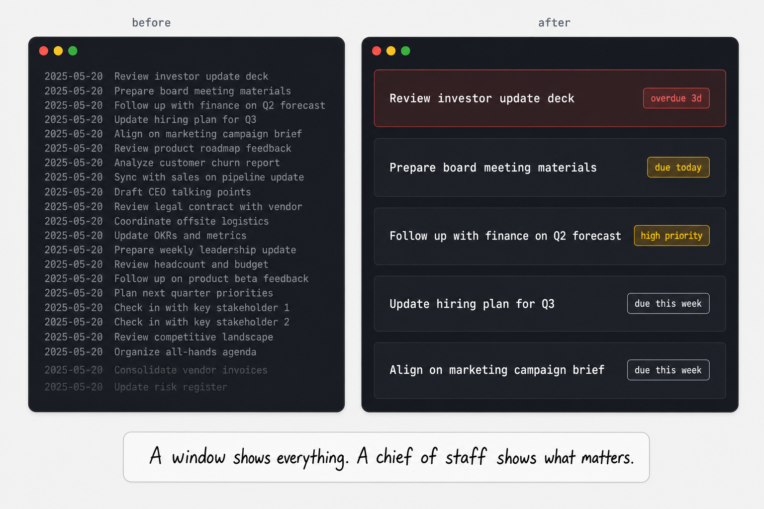
The previous article in this series ended with a line I believed at the time: "one source, multiple interfaces, no sync meeting required." The dashboard worked. Problem solved.
Six weeks later I started noticing something. I'd open it, see the numbers (thirty-one tasks, eight high priority, four active projects) and still not know what to do. The dashboard was showing me a status report. It was not answering the question I was actually asking.
The question is always the same: what do I do right now?
A window into a system shows you what's there. A chief of staff answers the question. The original dashboard was a very good window. I rebuilt it to be the second thing.
The answer was already in the vault
Every project and area MOC file in my vault has the same four sections: High Priority / Critical, Next Actions / Current Tasks, Waiting On, Someday/Maybe. This is the GTD structure that Charles uses to understand urgency and state. When he reads a MOC, he knows that a task under High Priority is different from a task under Someday/Maybe even if both carry the same priority emoji.
The original dashboard parser didn't know this. It extracted tasks from MOC files, sorted by due date and priority marker, and showed them in a list. A task sitting in Someday/Maybe with a 🔼 emoji looked identical to a Next Actions task with the same emoji. The parser was treating all tasks as equivalent inputs and letting date math do the ranking.
The fix was four lines of code:
current_section = None
for line in lines:
    if line.startswith("##"):
        current_section = line.strip("# ").strip()
    elif is_task_line(line):
        task["section"] = current_section
Every task now knows which heading it lives under. Someday/Maybe tasks disappear from "do now" surfaces. Waiting On tasks go to a separate view. High Priority / Critical feeds the Focus Queue first.
The vault's own organizational structure became the UI's ranking logic. Not a new schema designed for the dashboard. The same section headings that organize every MOC, read differently by the parser.
The Focus Queue
Five tasks. Scored. Ranked. One card each.
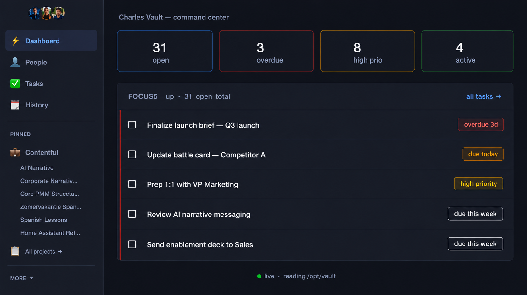
Each card shows the task text, the project it belongs to (resolved from the MOC file path), a time estimate if the task has a #time/ tag, and a reason: a one-line label explaining the score.
The scoring is a four-tier cascade:
- Overdue → "overdue Nd" (days count)
- Due today → "due today"
- In the High Priority / Critical section → "high priority"
- Due this week → "due this week"
First match wins. No weighted formula. The reason is what makes it useful: not just a ranked list, but an explanation of why each item is here. "Overdue 3d" is a different conversation starter than "due today."
If fewer than five tasks meet any of those criteria, the queue shows what's available and stops. A short queue is information. It means the urgent tier is genuinely empty, which is worth knowing.
Project Health Grid
One card per active project. Three states: green, amber, red. And a reason.
The reason is what turns a status indicator into something actionable. Red because of three overdue tasks is a different conversation than red because a deadline is tomorrow. Amber because a project has been quiet for five days is different from amber because there is no scheduled next action.
Each card shows the project name, open task count, next due date, the top task preview, and a status label in the matching color. At a glance: which projects need attention, which are moving, and which have gone quiet.
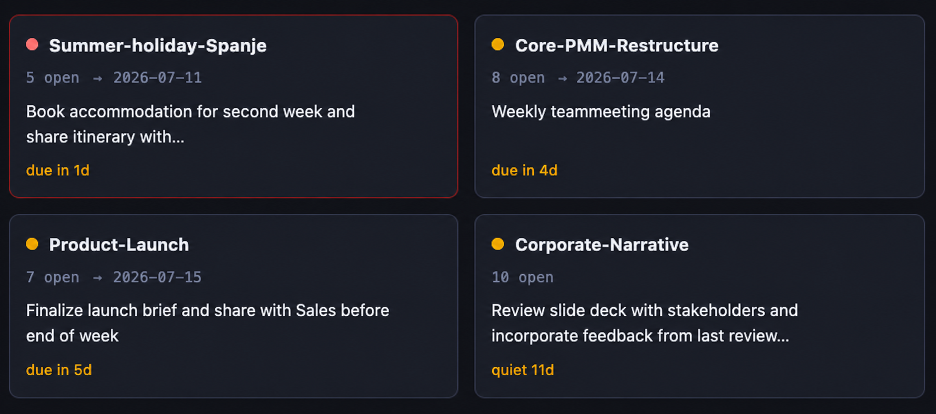
Click any card: the Project Desk opens.
Project Desks
The desk replaced the kanban as the default project view. Three sections on screen:
Next action hero card. The single highest-priority open task from the project, pulled from the High Priority / Critical or Next Actions sections. Large, front and center. Not a list. One task. The most important thing in this project right now.
Tasks grouped by MOC section. All open tasks from the project, organized the same way the MOC file organizes them: High Priority first, then Next Actions, then Waiting On. Someday/Maybe is collapsed. It's not relevant to right now. The grouping mirrors the vault's structure, so navigating the desk feels like navigating the file without opening it.
People. Names resolved from project wikilinks ([[Name]] references in the MOC file), linked to their person notes in the vault. A project that involves three people shows three names, each a click away from their full context.
The kanban view still exists at ?view=board. It's not gone, just demoted. The desk is the default because "what do I do right now?" is a more common question than "how are my tasks distributed across status columns?"
The people follow-up surface
One more page: /people.
Open todos from person notes across all relationship areas (direct reports, contacts, personal relationships), grouped by person. A checkbox on each item. Tick it in the browser and the server writes [x] to the person's note file in the vault.
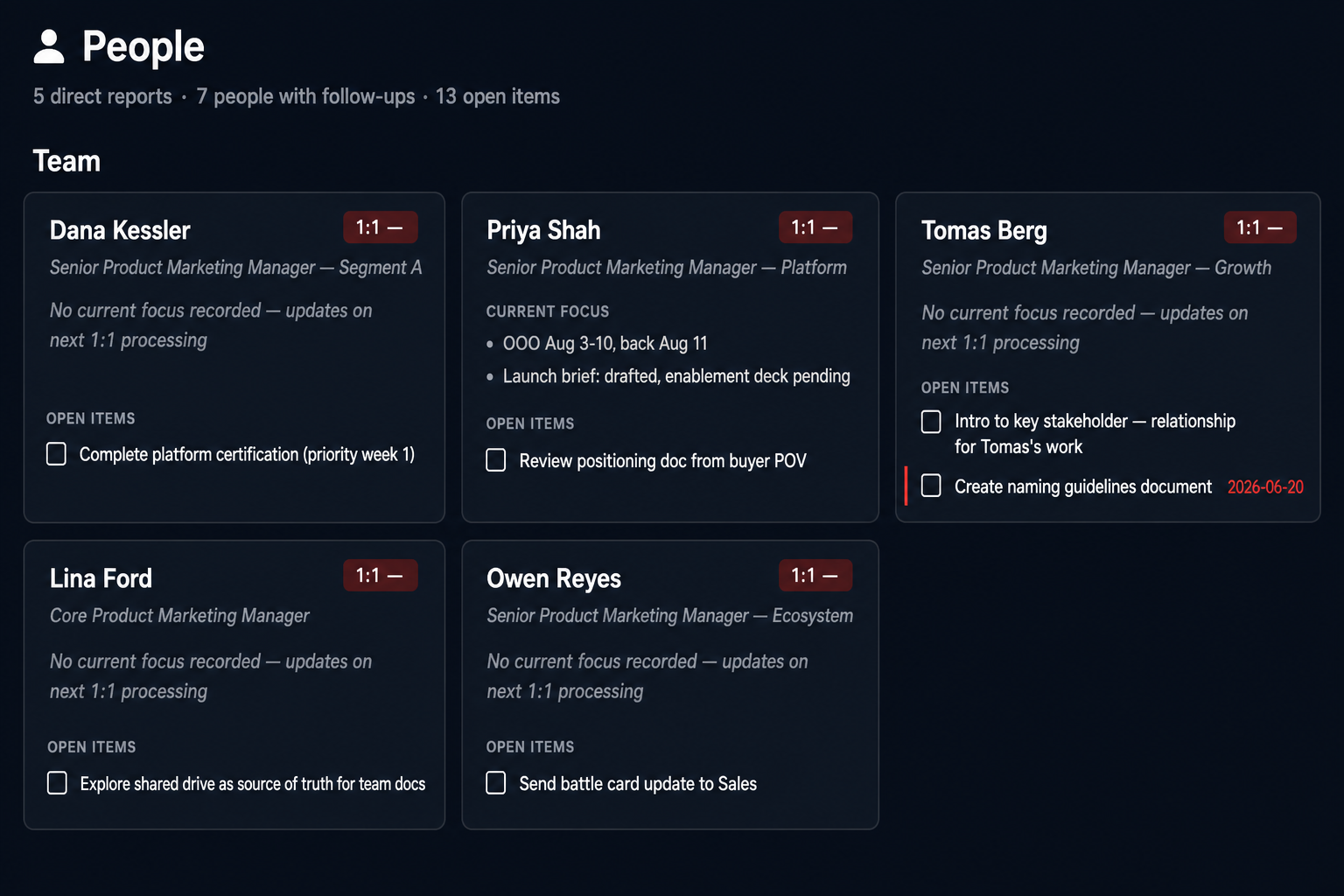
The problem it solves: a follow-up commitment made in a meeting doesn't naturally belong in a project MOC. It belongs to the person. Before this page, those tasks lived in person notes but had no dedicated surface. You'd see them only when Charles surfaced a relationship health alert or when you opened a specific person file directly.
The people page makes relationship commitments visible in the same dashboard session as project work, without requiring a project structure that doesn't match how you actually track people.
What this taught me about interface design for AI systems
The original dashboard was a better document viewer than Obsidian's mobile app. That's a useful thing to be. It is not a chief of staff.
The redesign didn't add more data. It added more decisions. Each surface (Focus Queue, Health Rail, Project Desk, People page) takes information that was already in the vault and applies a decision rule to it. The Focus Queue decides what's most urgent. The Health Rail decides which projects need attention. The Desk decides what's most important within a project. The People page decides which relationships have open commitments.
The decision rules were already encoded in the vault's structure. High Priority / Critical and Someday/Maybe are explicit signals. The headings that organize every MOC file were already saying something about urgency. The original dashboard just wasn't listening.
Section-aware parsing was the unlock. Once every task knew which heading it lived under, the vault's GTD structure became the UI's logic. Same files. Same headings. Different reader.
The test I'd apply to any interface added to a system like this: does it show data, or does it answer a question? A dashboard that shows data is a window. A dashboard that answers a question is a tool.
The answer to "what do I do right now?" was always in the vault. The redesign just taught the interface to find it.
The Second Brain Stack. Next: the date semantics that made "overdue" mean something.
The Second Brain Stack, in order:
- How I promoted my AI from chatbot to chief of staff
- The skills layer: what compounding actually looks like
- The vault: why the foundation matters before the AI does
- CLAUDE.md is not a prompt. It's a Personal Operating System.
- MCP: the live data layer your AI system is missing
- My AI Chief of Staff Used to Have Office Hours. Not Anymore.
- The interface layer: I built a web dashboard for my second brain
- My dashboard stopped showing me documents and started answering: what now? (you are reading this)
No comments section here. The LinkedIn post is the place for discussion. I read every reply.
Enjoyed this? Read the extended cut on the Second Brain Stack Substack →